


Today, many organizations embed analytics solutions within their own software to bring business intelligence (BI) capabilities, such as dashboards, directly into their product experience.
As a product manager, you likely know the importance of future-proofing your application with advanced analytics, and the benefits it brings for business and customers. However, ensuring your users leverage your analytics in the ways you intend them to requires some guidance.
To help make analytics more seamless for your audience, the best embedded analytics solutions are designed to enable seamless integration with your existing software’s look and feel, and provide simplified but customizable design tools that allow regular users, designers, and analysts alike to present data in ways everyone can understand.
So, how can you tell if an embedded analytics solution provides the flexibility and simplicity in design that you need to guide your customers through their data? There are three critical analytics design features to consider when assessing solution vendors in the market today.
1. Full white-label analytics support
Product owners invest significant time creating a unique design language for their software. It helps your brand stand out from the crowd, and helps customers identify with your experience.
When you’re embedding analytics into your product, you need a solution that makes it effortless to adapt to your native app’s existing look, so anyone who uses your dashboards will be able to view their data with the same colors, logos and portals they already know - without the confusion of a completely different looking third-party solution. This is referred to white-labeling analytics.
White-labeling helps minimize the demand on your in-house developers, designers and UX teams when embedding analytics, as your in-house team may not have the extensive expertise or time to match the embedded analytics solution with your existing software. White-label functionality also makes it simpler to increase user engagement with a unified design.

Many analytics vendors provide some level of white-labeling, but often limit the level of change you can make to ensure the embedded analytics suite looks on-brand. With Yellowfin, we put emphasis on flexible analytics design options to provide true end-to-end white-labeling support, with a drag-and-drop properties editor that requires no coding experience to begin configuring and styling elements, as well as the ability to use the CSS if deeper customization is desired.
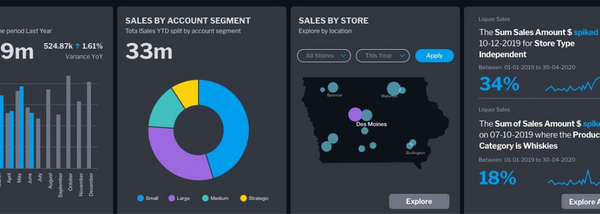
Charts, dashboards and reports can be fully styled and customized to match your product’s design, as well as headers, footers, images and login portals, so that when analytics is fully embedded into your software, end-users cannot tell it apart from the core product experience. Instead of rigid, traditional-looking dashboards, you have free reign to design all aspects.

For product owners that want specially tailored experiences, sub-branding allows for several customized styles to be applied to your dashboards depending on who accesses your application’s analytics. For example, if you host a multi-tenant application that requires each tenant to have its own brand displays, Yellowfin’s sub-branding allows you to define tenant-specific stylesheets and images for a unique experience for every client organization.
2. Drag-and-drop, easy-to-customize dashboard builder
Enabling data-driven workflows is one of the core reasons to embed analytics. When customers access and look at a report or dashboard in your product, you want them to feel it’s simple to use, logical in flow, and look like it’s a part of the normal experience. They may not even express this to you, but just use that dashboard as normal, discover an insight, and then take action.
You want that same seamless flow for building dashboards. If your developers decide to build a dashboard or report themselves when end-users request them, you want them to be able to use these analytics tools independently. That requires a solution tailored for every type of in-house skill level - and that makes it easy to make reports look good.
Analytics tools in the past were designed only with analysts in mind, and were often unappealing visually, and that sort of approach doesn’t work now. If the interface to build dashboards is complex, and they look boring, there’s no guarantee your internal teams can build compelling content easily, nor will end-users necessarily engage with or find value from the new tools you just invested in.

To make this easier, Yellowfin has focused heavily on providing design flexibility across all of its components, including our dashboards, to help product managers realize this seamless user experience. The way we’ve built our suite allows your developers to leverage proven design principles and best practices when building dashboards and reports for end-users’ requests, while making it easy to make data as visually appealing and interesting as possible for maximum engagement.

Yellowfin dashboards are built in a free-form design canvas that supports a visual-based, drag-and-drop interface that requires no code to get started. Both regular users and more experienced designers can leverage a wide range of graphics tools to assemble pixel-perfect, creative and on-brand reports, in any type of grid or layout.
Widgets can be overlaid next to and on top of each other — icons, shapes, text and images — to create dashboards that meet their needs, and fit the same look as your product. You can even add augmented features such as automated alerting and data storytelling via widgets for further interactivity. This differs from other analytics vendors who provide predefined and typically inflexible templates.
For your developers, it’s made easier to build visually stunning analytic content that guides your users through their data, and your end-users can independently build analytic content without having to rely on your product team to explore their data, thanks to true self-service tooling. The value flexible dashboard design brings to their analytics experience cannot be overlooked.

3. Collaboration and code modes for developers and designers
Flexible analytics design also doesn’t just mean simplified design tools, but also collaboration.
A good dashboard experience is one that enables an iterative collaboration between end-users, data experts and designers; your end-user defines what data they need, your analysts translate that information, and your designers/developers determine how to present it in a way that can easily be read and acted on.
Yellowfin fosters this collaboration process with its blueprint mode, which allows dashboard designers to feed into the planning stage and concept with end-users and analysts, ensuring the designer's knowledge around UX, UI design and user behavior can be combined with best-practice data visualization for a well-considered product experience.

And while simplified, visual-based drag-and-drop interfaces make building reports more accessible for more people, sometimes your dashboards may need more advanced design options to truly make it seamless with your product.
Yellowfin offers a code mode which allows developers to directly import CSS, enabling immediate adaptation of any existing visual style guide directly into the dashboard designer. Code mode supports HTML and Javascript to push functionality around data visualizations without having to learn any new coding languages, meaning any developer can use Yellowfin.
Explore best practice analytics design in our dashboard gallery
Ultimately, being able to seamlessly integrate your analytics solution with your product’s existing look and feel, and ensure end-users engage with these new features, requires flexible design tools that make it easy for everyone to build and understand analytic content.
View the Best Practice Dashboard Gallery. 👇
Yellowfin is a global analytics and business intelligence (ABI) software vendor with a suite of world-class products powered by automation.
Yellowfin is recognized as an innovator by the world's leading analyst firms. More than 29,000 organizations and over 3 million end-users across 75 countries use Yellowfin every day.


Become a PLA Insider
Thank you for subscribing
Get exclusive insights, frameworks, and strategies from product leaders driving real business impact.
An email has been successfully sent to confirm your subscription.
 Follow us on LinkedIn