








Most B2B products fail quietly. The contract gets signed, the implementation team shows up, then three months later someone runs a utilization report, and the number is embarrassing. The standard diagnosis: the rollout was weak, which means not enough training, not enough communication, and the change management plan needs another phase.
That explanation is comfortable because it puts the blame on execution. It implies the product was right – we just didn't explain it well enough.
At Choice, we couldn't use that excuse. Our platform connects employers, employees, and benefit providers in a three-sided marketplace. Employers configure the system. Employees log in and choose their own benefits package. The key word is choose. Nobody forces employees to open the app. Nobody puts it on their performance review. It's entirely optional – which meant that from day one, if people didn't use it, we had nowhere to hide.
That constraint turned out to be the most useful thing that ever happened to us as a product team.
The first signal we ignored
Our first pilot was a logistics company with around 80 employees. The HR director was excited. We implemented it in three weeks, ran a short orientation session, sent a welcome message, and waited.
Week one: 34% of employees logged in (we celebrated).
Week three: Active usage had dropped to 11%.
Our first instinct was rollout – more reminders, a second orientation, maybe a poster in the break room. We ran all of it. Usage climbed briefly, then settled back down around 15%.
That's when we asked the question we should have asked first: why aren't people coming back?
We talked to employees directly, in actual conversations. What we heard was very simple: “I logged in, looked at the options, didn't see anything I wanted, and closed it.”
The product had failed, not the rollout.
What the data was actually telling us
We’d been reading our metrics wrong. Login rate felt like a success signal, but it just tells you the communication worked. It tells you nothing about whether the product delivered value.
The metric that mattered was what we now call selection completion – the percentage of employees who logged in and actually built a benefits package. In that first pilot, selection completion was 23%, meaning roughly three out of four people who showed up left without doing anything.
When we dug into the drop-off points, the pattern was consistent across all three pilots we'd run by that point:
- Drop-off one: Category mismatch. Employees would land on the benefits catalogue, scan the categories, and find that the things they cared about weren't there. That wasn’t because we had bad providers – we had 40+ at that point – but simply because the categories visible on the front page had been chosen by HR, not by employees. We were presenting what HR thought mattered.
- Drop-off two: Cognitive overload at the selection screen. When we did have relevant options, we had too many of them with too little differentiation. Employees were being asked to choose between eight insurance providers without a clear basis for comparison. The natural response to that is to defer the decision indefinitely.
- Drop-off three: Unclear budget display. Employees didn't understand how much they had to spend or what happened to unspent points. Ambiguity about the rules created anxiety. Anxiety killed action.
None of these were communication problems. All three were product problems.
Reframing the question
The standard change management question is “How do we get employees to use this?” The question we switched to: “What would make an employee want to come back tomorrow?” That shift in framing changed the way we prioritized the product roadmap.
The answer to the first question sends you toward push mechanisms – notifications, manager prompts, gamification, and reminder emails. These can juice short-term engagement numbers, but they don't create sustained use because they're extrinsic. The moment you stop pushing, usage drops.
The answer to the second question sends you into the product itself. What did they find when they arrived? Did they see something they actually wanted? Did they feel confident making a selection? Did the outcome feel worth the effort of coming back?
That's a product design conversation.
The three changes that had the biggest impact
1. We put employee-expressed preferences before HR assumptions.
We added a short preference signal at onboarding – four questions about what categories mattered most to the individual employee. We used those signals to reorder what they saw first. Employees who indicated family and childcare as priorities saw those categories front and center. Employees who indicated sport and wellness saw a different front page.
This sounds simple. It is simple. But it required us to stop designing the catalogue as a single experience and start treating it as something that should adapt to the person using it. Selection completion went from 23% to 51% within six weeks of this change going live.
2. We reduced choice at the point of decision.
We had too many options. More options is not more value when the decision-maker doesn't have a basis for comparison. We worked with our provider partners to create tiered displays – a recommended option for each category based on the employee's profile, with secondary options available but not leading.
Counterintuitively, reducing visible choice increased selection. Employees who previously deferred decisions because they felt uncertain about which option to pick now had a clear starting point. They could accept the recommendation or explore further. Most accepted. The ones who explored further were more engaged, not less.
3. We made the budget logic transparent and concrete.
We redesigned the budget display to show three things clearly: what you have, what you've spent, and what happens to the remainder. We eliminated the ambiguity. When employees understood that unspent points were either rolled into the next period or available for a different category, the paralysis around “what if I pick wrong” largely disappeared.
The budget display change was the cheapest thing we did. It took a week to implement. It had one of the largest effects on completion rate of anything we shipped that quarter.
What this means for any PM shipping an optional-use B2B product
The structural problem with most B2B rollouts is that the buyer and the user are different people. The HR director signs the contract. The employee uses the product. The HR director’s incentives are around compliance, reporting, and cost management. The employee's incentives are entirely personal.
When adoption fails, the buying organization tends to push harder on buyer-side levers – more manager communication, more mandatory training, more tracking. These can create temporary spikes in usage, but they don't create value for the end user, so sustained adoption doesn't follow.
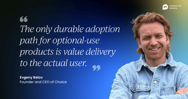
The only durable adoption path for optional-use products is value delivery to the actual user. That sounds obvious. It isn't, because the product metrics you have easy access to – logins, sessions, clicks – can make it look like adoption is happening when it isn't.
The metrics worth tracking are completion metrics (not engagement metrics). Did the user do the thing the product is designed to help them do? If not, where did they stop? Every drop-off point is a product hypothesis to test.
The signal to trust most is not your power users. Power users will adopt almost anything if it's directionally useful. The signal that matters is your median user – the person who logged in once, looked around, and left. Talk to them. Have a real conversation. The reason they left is almost always a product reason, not a communication reason.
One more thing: speed matters more than perfection on this. The window between first login and abandonment is short. Whatever friction exists in the product at that moment is the friction that determines whether you get a second chance. We shipped the preference signal feature in an unpolished state because we knew we needed it before month two. Visually, it wasn’t our best work, but it moved the number.
The HR director who signs the contract can mandate access, but they cannot mandate value. Value has to be earned inside the product, in the moments when a single employee is looking at a screen and deciding whether what they're seeing is worth their time.
That's the only adoption problem worth solving.


Become a PLA Insider
Thank you for subscribing
Get exclusive insights, frameworks, and strategies from product leaders driving real business impact.
An email has been successfully sent to confirm your subscription.
 Follow us on LinkedIn