


For one of the first products I had to work on, it took me nearly five days to figure out how to use the app and understand what the point of it was. Even as someone with a strong product mindset, it took me that long. I couldn’t even imagine how long it would take for a normal user to understand the app.
I had to ask my colleagues – people who worked on the same product, in the same office – to explain basic features to me, the point of those features or mechanisms, why certain screens existed, and what I was supposed to do next.
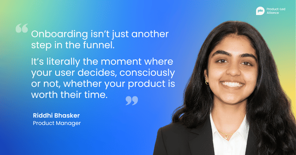
That experience changed how I think about onboarding entirely. It’s not just another step in the funnel, nor is it just a registration flow. It’s literally the moment where your user decides, consciously or not, whether your product is worth their time.
Most product teams get this wrong. Not because they don't care about onboarding, but because they're optimizing for the wrong thing.
The data collection trap
Here's what onboarding usually looks like from the inside of a product team: we need the user's name, email, date of birth, profile photo, notification permissions, location access, and to accept our terms and conditions. Then we'll show them the product.
The problem is that while we're collecting all of that, the user is doing something entirely different – they're making a decision.
Every screen they have to get through before they see value is a question they're asking themselves: Is this worth it?
Every extra tap, every form field, every permission request is just seen as friction, and that friction compounds. Not only does it slow your users down, but it gives them more opportunity to leave.
The uncomfortable truth is that user data is worthless if the user doesn't make it through onboarding. You don't have a retention problem yet. You have a conversion problem. And no amount of re-engagement campaigns will fix a product that loses people before they've even started.
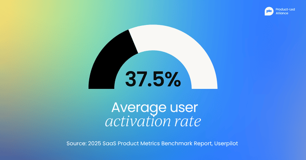
The numbers bear this out. According to Userpilot's 2025 SaaS Product Metrics Benchmark Report, which analysed data from 62 SaaS companies, the average user activation rate is just 37.5%, meaning nearly two-thirds of people who sign up never experience the product's core value.
The problem isn’t that products are bad, nor is it that users aren't patient enough. The problem is that most onboarding flows are designed around what the team needs from the user rather than around reducing the cost the user pays to get to value.
The product blindness problem
There's a reason product teams don't catch this earlier. It isn't laziness, but a very specific kind of blindness that comes from knowing too much.
When you build a product, you understand it completely, you know what every button does, you know why screens are ordered the way they are, and you know what the terminology means. So, when you test your own onboarding, it feels intuitive – because to you, it is.
But your users come in with none of that. They have fresh eyes, zero context, and about five to ten taps before they decide whether to stay or leave. And within those five to ten taps, they need to decide whether they understand the point of your product.
Research suggests the average attention span for a new digital experience is shrinking, and users are making judgments faster than ever. You don't have long to catch their attention and convince them to stay.
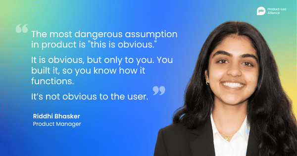
The most dangerous assumption in product is "this is obvious." It is obvious, but only to you. You built it, so you know how it functions. It’s not obvious to the user.
There’s a psychological explanation for why this happens. Cognitive Load Theory, developed by psychologist John Sweller, identifies two types of mental effort users experience when interacting with an interface:
- Intrinsic load is the inherent difficulty of the task itself.
- Extraneous load is the additional mental effort caused by poor design, confusing navigation, too many steps, or unclear labels.
Extraneous load is entirely within the product team's control, and it’s the load most onboarding flows are unknowingly maximizing. When a new user hits a ten-step registration flow, they’re not just completing a process; they’re spending cognitive resources that should be going toward understanding your product's value. By the time they get through, many have already decided it is not worth the effort.
What every onboarding flow is actually charging your users
Once you start seeing onboarding through this lens, a useful framework emerges. Every product charges the user a cost to access its value, and that cost is paid in cognitive effort: the thinking, deciding, remembering, and interpreting a user has to do before the product pays them back in value. I call this the Cognitive Entry Tax, and it is the single most useful lens I have found for diagnosing onboarding.
The tax has two components, and the distinction between them is where most teams get stuck.
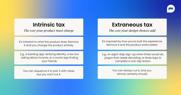
Intrinsic tax is the cost inherent to the product itself. Tax software has to ask the user about their income; a banking app has to verify identity; a social network has to know who your friends are. You cannot remove intrinsic tax without changing what the product fundamentally is. You can only sequence it, defer it, or make the cost feel worthwhile by pairing it with visible value.
Extraneous tax is the cost your design choices impose on top of what the product actually requires. It’s the eight-step registration flow when three would do. It’s the jargon-riddled label that forces the user to decode what a screen is for. It’s the navigation structure that makes a core action take three taps when it could take one.
Extraneous tax is entirely within your team's control, and it is almost always the tax that is killing your activation rate.
The framework reduces to a single rule:
Every screen, every field, every tap in your onboarding is either paying intrinsic tax or extraneous tax. Identify which is which. Drive extraneous tax to zero. Sequence intrinsic tax behind visible value.
This sounds simple, and the rule itself is, but applying it is where most teams get stuck. The hardest part is distinguishing intrinsic from extraneous, because every screen in your onboarding has been justified by someone on your team at some point.
The rule that helps: if the product can still demonstrate its core value without this data point, this screen, or this tap in the first session, then asking for it in the first session is extraneous tax.
What I changed and what happened
Fixing onboarding rarely means starting from scratch. In my case, it meant understanding exactly what we already had – where users were dropping off, why, and what it would take to get them through. Here's how that looked in practice.
Starting with the data
When I finally acknowledged that the app I was working on had a serious onboarding problem, the metrics I tracked gave us the whole picture.
We were tracking drop-off rate per registration step, completion rate, and taps per screen, which included where on the screen users were actually tapping. Users were abandoning at specific steps in the registration flow, not randomly. That told us the problem wasn't the product, it was the path to the product.
Drop-off isn’t a signal of general friction; it’s a signal of specific screens where the extraneous tax we were charging the user had exceeded the value they believed they would receive.
Mapping everything
Before cutting anything, I mapped every screen in Figma. I took screenshots of the entire app, exported them, and manually traced every navigation path, where each click landed me as a user.
Seeing the full map made the problem obvious in a way that no amount of internal debate had. The complexity wasn't hidden. It was just never laid out in one place where anyone could see it.
This step sounds mechanical, but it’s where most audits succeed or fail. Product teams discuss onboarding screen-by-screen, in isolation, which is how extraneous tax accumulates invisibly. Nobody decides to build a ten-screen registration flow; it accumulates one justified decision at a time. The Figma map is the tool that converts a series of individually defensible decisions into a single collectively indefensible artefact.
Asking the same question of every screen
The app had around ten different pages. Navigation was complex. Getting to your own profile required three separate taps, page to page to page. Features had names that meant nothing to a first-time user. There was no clear sense of what to do first, or why.
Walking through the map, the question I asked of every screen was the same: Is this intrinsic, or is this extraneous?
Almost every navigation decision fell into the second category. None of it was intrinsic to the value the product delivered. All of it was extraneous tax we had introduced, and all of it was cuttable.
Stripping it back
We stripped our app back. Three main pages. One tap to get anywhere that mattered.
The landing page showed everything a user needed to see immediately: content, social activity, and a navigation bar. The profile page had the gamification elements, visible without hunting for them. The friends page did one thing and did it clearly: help show the user their friends and other people they could add.
I didn't add anything new, no new features or mechanics, same features, just presented in a way that didn't boggle the users’ minds. I removed things until what was left made sense.
The results
Registration completion increased by about a third.
Session times grew over the following weeks as users who actually made it through onboarding found reasons to come back.
The product hadn't changed. The value was always there. We'd just stopped charging too high an entry tax – and that’s what every onboarding redesign actually is, whether the team frames it that way or not.
The five-to-10-tap window
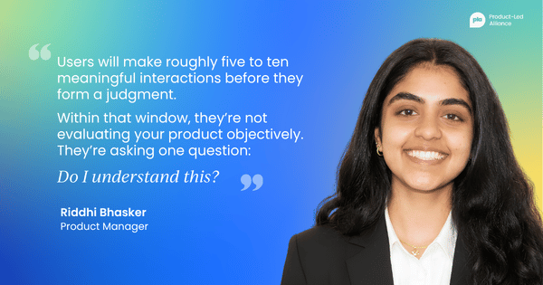
Here is what I’ve observed consistently across the products I have worked on: users will explore. They will tap around, see what works, and try to find their bearings. But that window is short, roughly five to ten meaningful interactions before they form a judgment.
Within that window, they’re not evaluating your product objectively. They’re asking one question: Do I understand this? Not “Is this well designed?” Not “Does this have good features?” Just “Do I understand what is happening, and do I see the value of this?”
If the answer is no, they leave, and most of them don't come back. You lose them in that first window, and only return if something external pulls them back. If a friend recommends it again or they see another ad, they might give you a second chance – but you can't build a product strategy around second chances.
Think about TikTok. You open the app for the first time, and within three taps, you’re already watching videos tailored to you. There’s no lengthy registration before you see anything. There’s no profile setup required before value is delivered. A small tooltip, a virtual hand that shows you to swipe, and that is your entire onboarding.
By the time you’ve made an account, you already know exactly why you are coming back. The value landed before the friction. After that, the user will come back on their own terms and explore other features. They’ve already seen the value, so they won't mind taking extra time to look around and play with other features.
That’s the standard. Not every product can be TikTok, but every product can ask How quickly can we show the user something worth coming back for?
This reframes what onboarding is actually for. It’s not a registration process or a tutorial. It's a pitch; you’re pitching your product to your users. You’re making a case, in real time, through the product itself, that what you've built is worth the user's continued attention.
The pitch has to land in the first session. Everything else is too late.
How to fix your onboarding in six steps
When I realized our onboarding was broken, I didn't start by designing new screens. I started by understanding what we already had. This is the audit I now run on every onboarding flow I inherit. Six steps, all of them in service of one question: What is the user being asked to pay for, and is it worth it?
Here’s the process that worked for me:
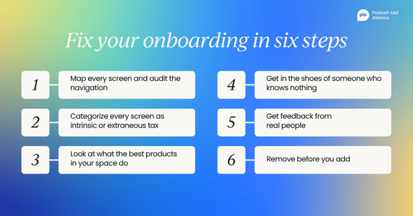
Step 1: Map every screen and audit the navigation
Write out every single screen a new user touches from download to first meaningful action. Count the taps. Most teams are genuinely surprised by how many there are. If you can't draw the full flow from memory, your users definitely can't navigate it instinctively. The output of this step is not a diagram for its own sake; it is the artefact you will use to categorise tax in the next step.
Step 2: Categorize every screen as intrinsic or extraneous tax
For each screen, ask one question: would the product still demonstrate its core value in the first session without this screen? If yes, the screen is extraneous. If no, the screen is intrinsic.
Do this before you debate solutions. Most teams skip straight to "How do we make this better?" without deciding whether the screen should exist at all.
Step 3: Look at what the best products in your space do
Take a peek at leading products, not to copy them, but to understand the standard your users are used to. When someone downloads your app, they bring expectations from every other app they use. TikTok, Instagram, Duolingo, Revolut, Amazon – these products have trained users to expect value fast. That’s the baseline you are competing with, whether you like it or not.
When I was deciding on navigation structure, I audited over ten social apps, not just Instagram, TikTok, and Facebook, but smaller up-and-coming products like BeReal, Locket, and Yubo. I wasn’t looking for what looked good; I was looking for interaction patterns that my users had learned before they ever opened my product.
This is what Nielsen Norman Group calls building on existing mental models: the principle that users bring pre-formed expectations about how interfaces work based on every app they have used before.
When your navigation follows those conventions, you’re reducing extraneous tax before the user has even read a single label. When you deviate from them without a compelling reason, you’re forcing users to spend cognitive resources learning your system rather than experiencing your product's value. In most cases, that’s a trade they will not make.
Step 4: Put yourself in the shoes of someone who knows nothing
Explore your product not as a PM, not as someone who built it, but as someone who just saw an ad and tapped download with no other thoughts.
Walk through the flow and ask yourself honestly, Do I know what this is? Do I know what to do next? Do I understand why I should care?
Step 5: Get feedback from real people
Don’t just gather feedback from your team, the people who already understand the product. Ask people with fresh eyes.
Even five people walking through your onboarding and talking about what confuses them will tell you more than weeks of internal debate. Their confusion will tell you which of the screens you categorised as "intrinsic" are actually extraneous once you watch someone encounter them for the first time.
Step 6: Remove before you add
When onboarding feels broken, the instinct is to add tooltips, walkthroughs, and explainer screens. Under the framework, this is a category error: a tooltip to explain an extraneous screen still leaves the extraneous screen in place. You’re adding more tax to compensate for the tax you should have removed.
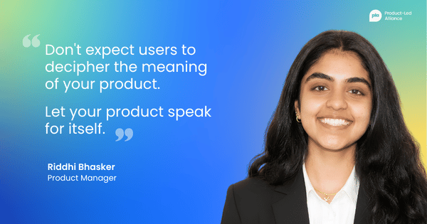
Cut screens, reduce taps, and simplify labels. Add navigation elements that make the structure obvious. The goal is not to explain your product better; it’s to make it need less explanation. Let your product speak for itself. Don't expect users to decipher the meaning of your product.
The only rule that actually matters
Every time I start thinking about onboarding now, I try to apply one discipline:
Let go of what you know.
You know why you built this. You know what problem it solves. You know what the terminology means and why the screens are ordered the way they are. Your user knows none of it. They arrive with fresh eyes and a very low tolerance for confusion.
The product's job in the first session is not to teach the user everything. It’s to answer one question fast: What is this, and why should I care? If you can answer that clearly, through what they see, what they can do, and what happens when they tap, you’ve earned the right to teach them more.
Put yourself in the shoes of someone who knows nothing about what you built. Not someone who has read the brief. Not someone on your team. Someone who saw an ad or got a recommendation from a friend, and gave you thirty seconds of their attention.
Build for that person, not for the version of the user that looks good in your planning doc. Every extraneous tax you cut is a user who gets through to the product you actually built.
Become product-led onboarding certified.
Gain a deeper understanding of how to create successful onboarding experiences and increase engagement.
By the end of this certification, you'll be able to:
- Increase engagement. Understand the best practices to instantly hook your users on your product.
- Strategize. Build a data-backed product onboarding strategy from scratch.
- Gain buy-in. Achieve leadership support by proving the value of a strong product-led onboarding program.
What are you waiting for?


Become a PLA Insider
Thank you for subscribing
Get exclusive insights, frameworks, and strategies from product leaders driving real business impact.
An email has been successfully sent to confirm your subscription.
 Follow us on LinkedIn